Lone Star College – Online is an established site that does not properly support the full student journey from discovery to graduation, along with content that had drifted out of date and was duplicated across pages. Before any redesign could begin, the site needed a rigorous audit, a clear content strategy, and a design foundation grounded in real user needs – all under a tight timeline.
Journey Driven
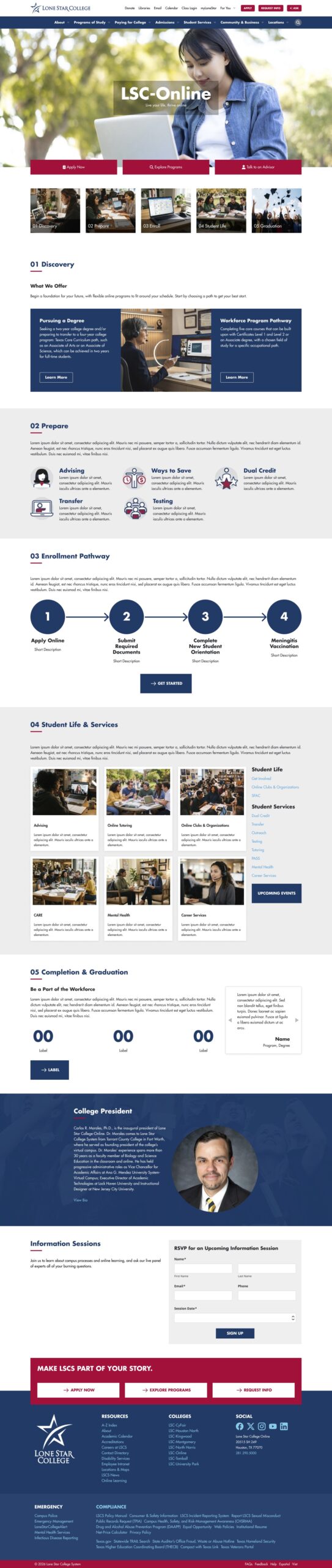
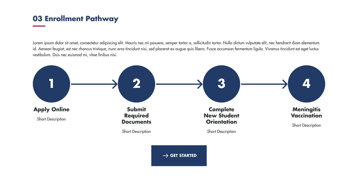
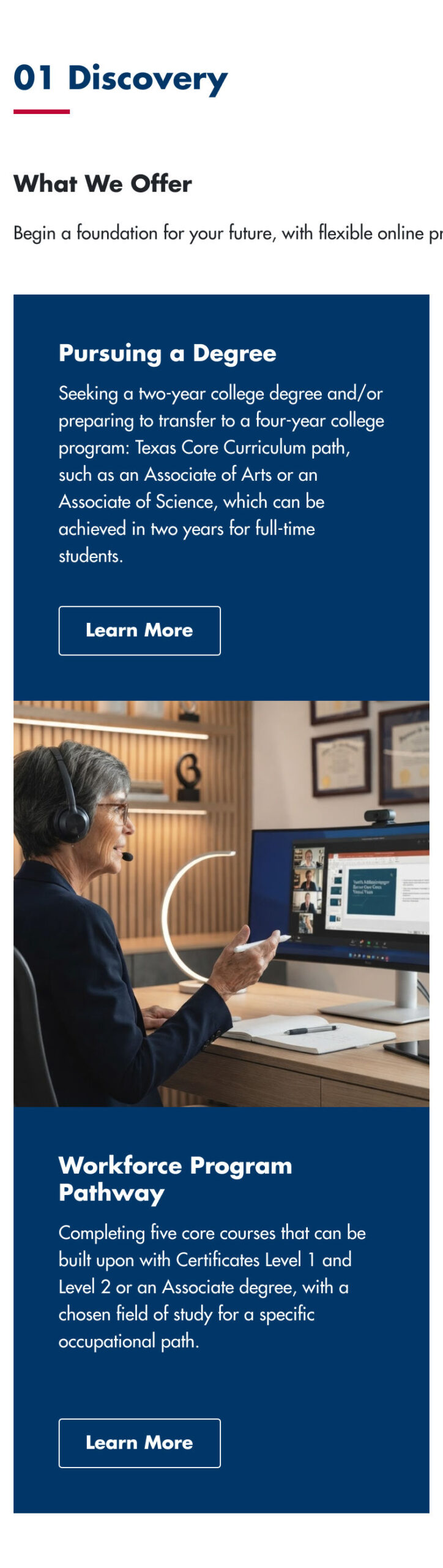
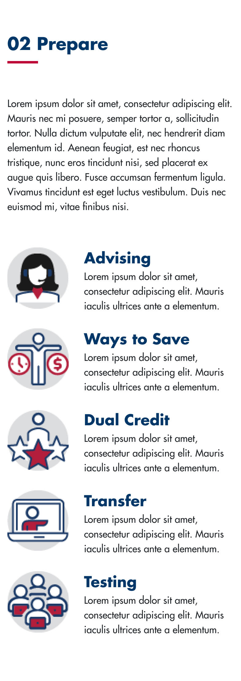
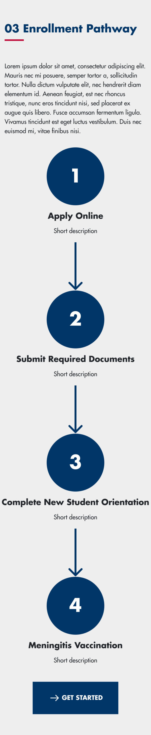
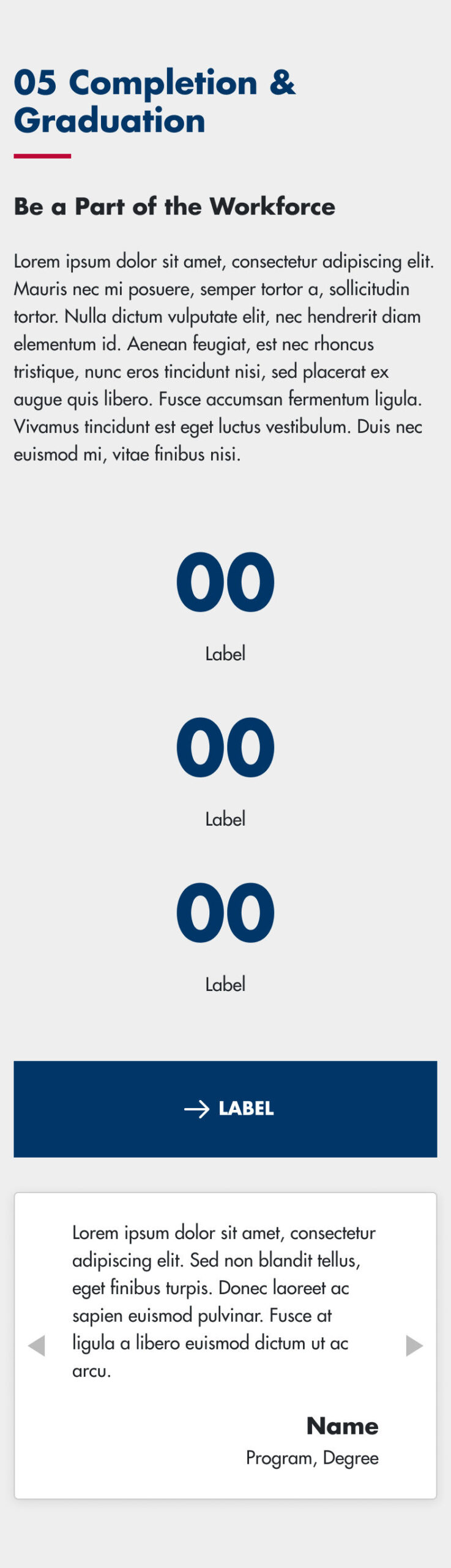
The site had to walk users through each step of the Student Journey Spine, from first interest to active enrollment.
Content Heavy
The existing sub-site held dozens of pages with outdated, duplicated, and thin content that needed to be inventoried and rationalized.
Dual Audience
The design had to serve both prospective and current students, whose needs and goals differ at each stage of the journey.
Tasks
As the contract Web Designer, I was tasked with auditing the full inventory of pages under the Online sub-site, defining a design and research strategy, modeling the site’s users, and producing wireframes and high-fidelity designs for a new home page organized around the Student Journey Spine.

Actions
Design Spec & Strategy
I authored a design spec document covering vision and intent, user context, design principles, and scope and constraints, then used it to draft and refine a project plan before executing.
Content Audit & Analysis
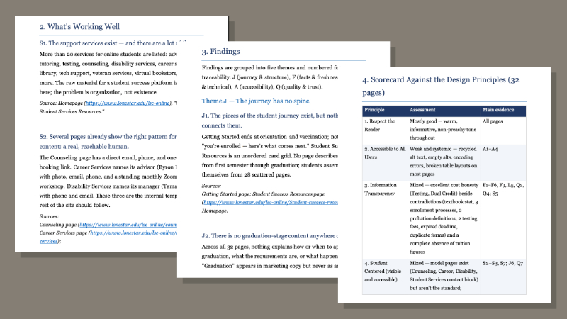
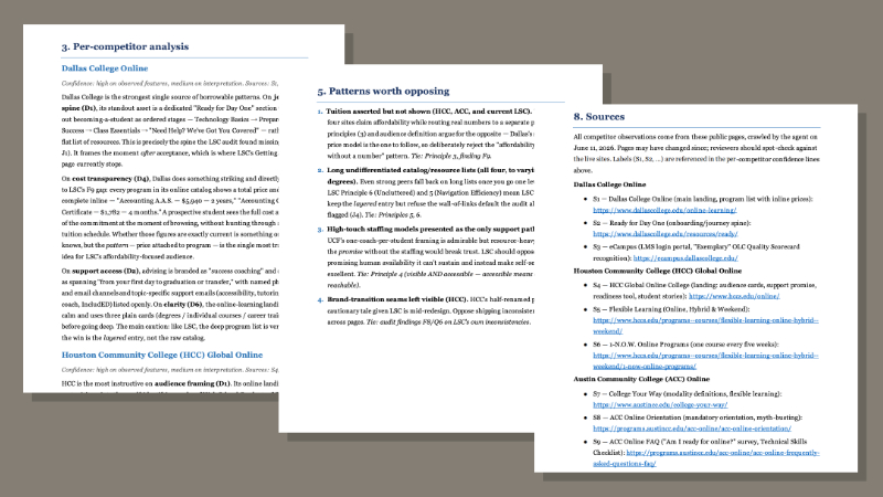
Given a short period to inventory and audit every page under the sub-site, I directed Claude (Opus 4.8) to crawl the site and flag outdated or duplicated content, thin pages, broken links, and redundant navigation. I managed the process across multiple passes – reviewing, providing feedback, and giving direction – until Claude produced a unified document.
Site Mapping
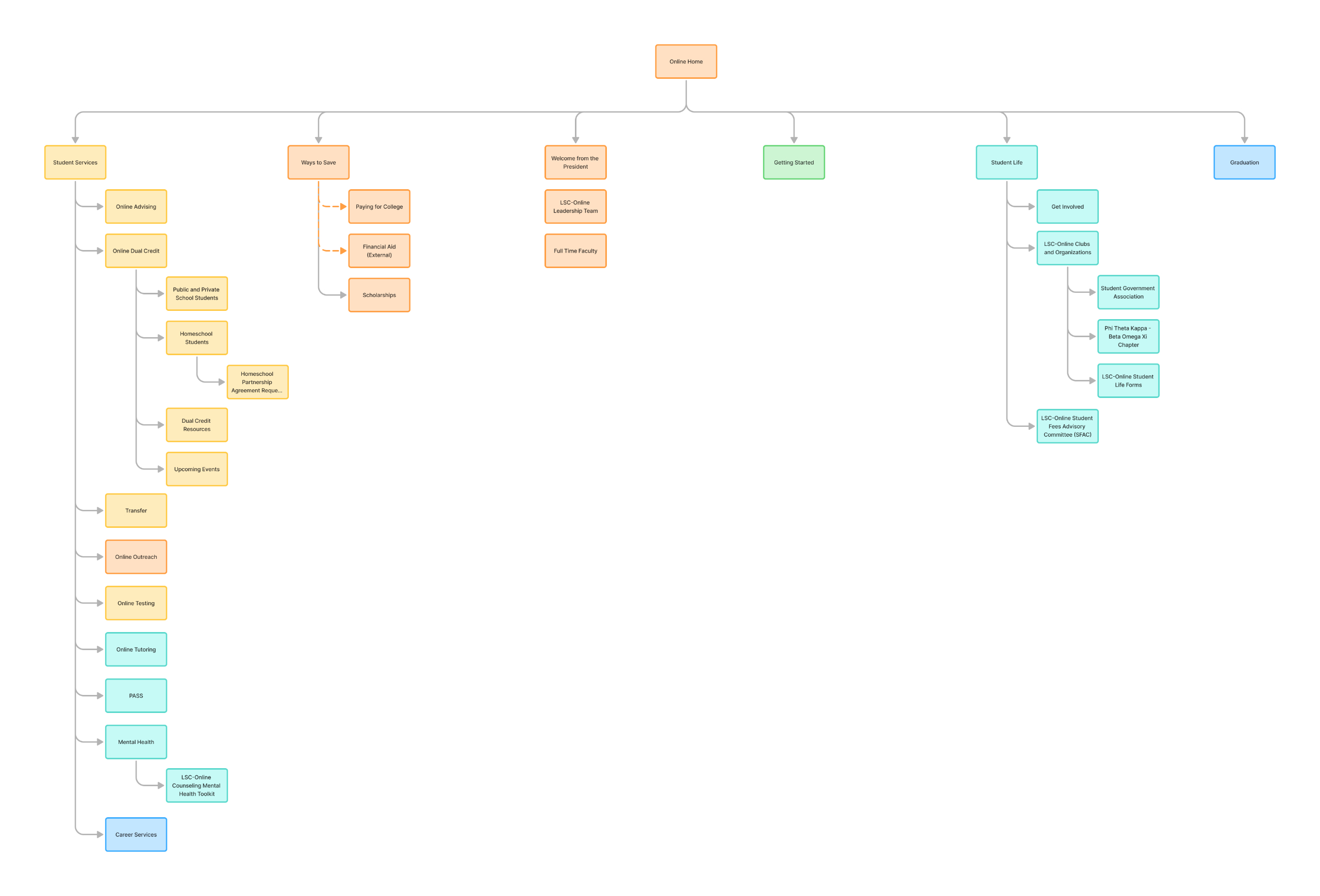
I captured screenshots of 25 pages and built a site map showing the relationship between pages, annotating issues that needed to be addressed and organizing existing pages against each step of the Student Journey Spine.
Personas
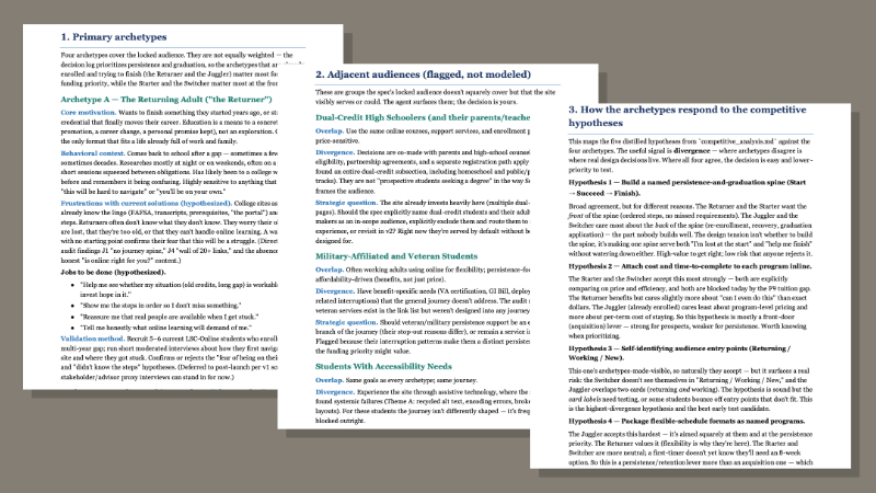
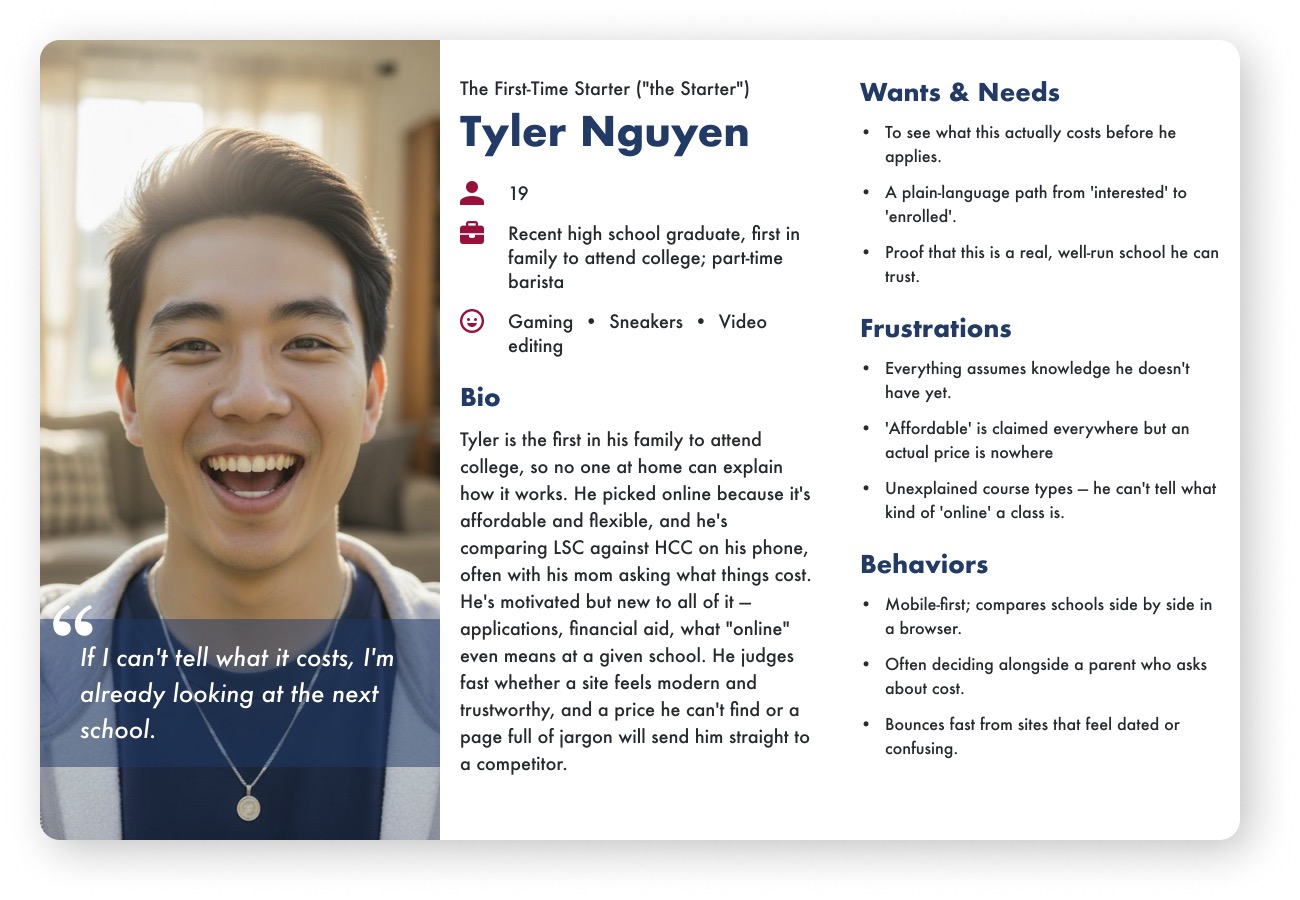
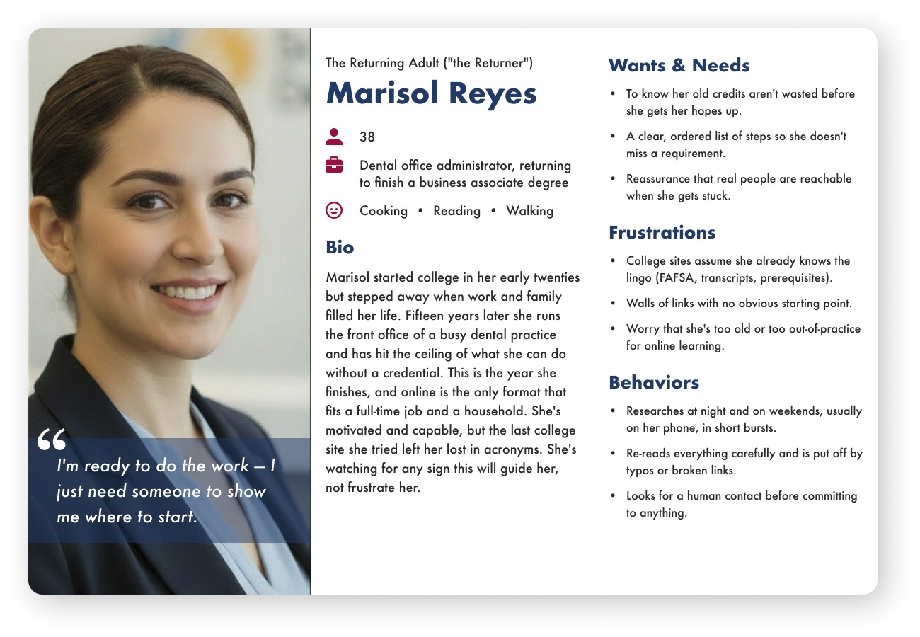
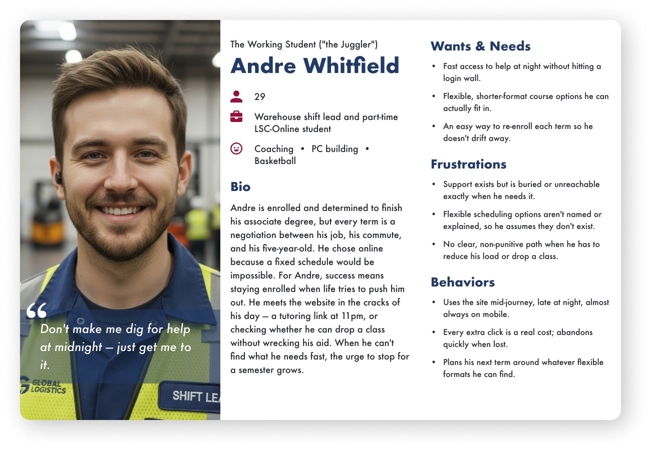
Using the design spec and user modeling documentation, I developed a set of four personas. I built a persona card template in Figma and generated photo-realistic imagery for each using Figma’s AI features.
Wireframes
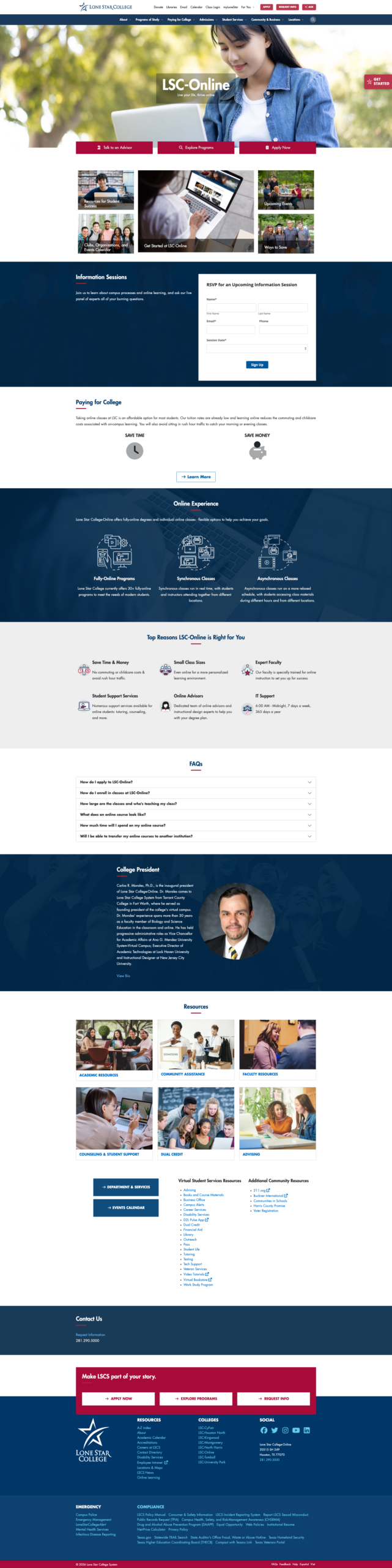
I created initial desktop and mobile wireframes of the home page based on the Student Journey Spine, designing components that would accommodate both prospective and current students.
High-Fidelity Design
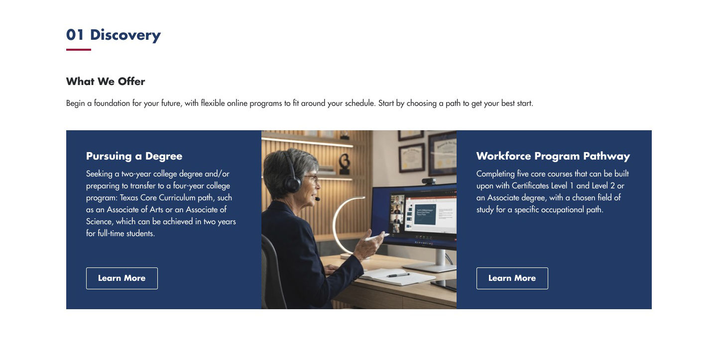
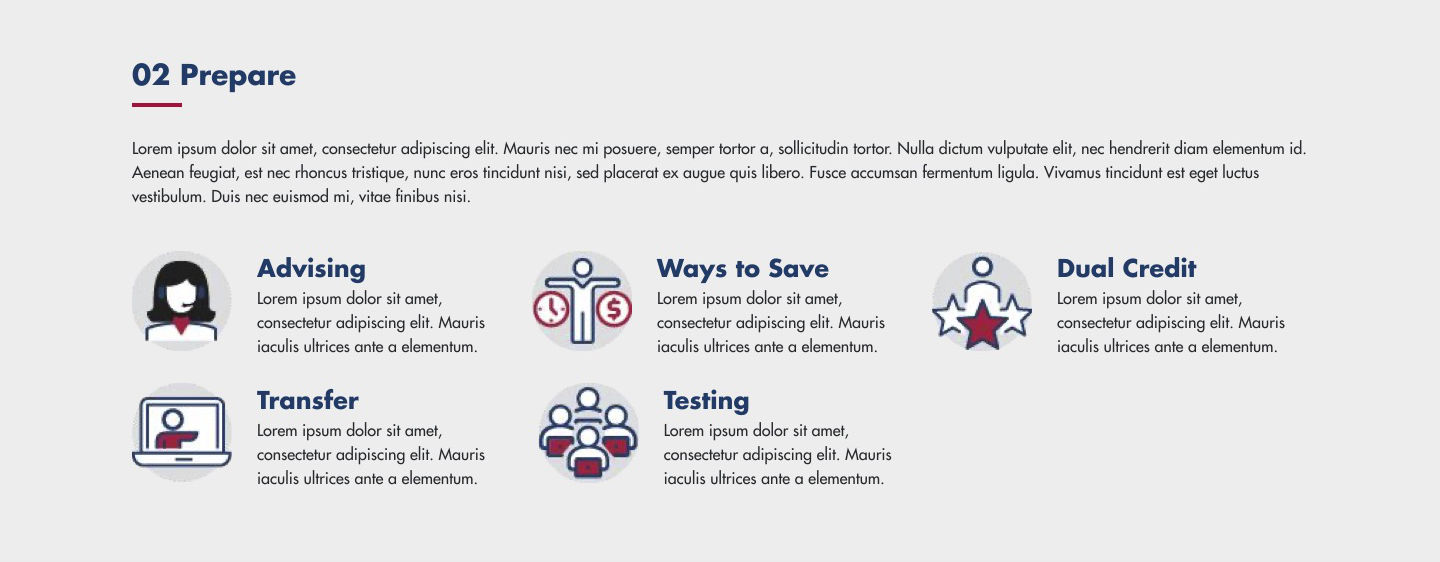
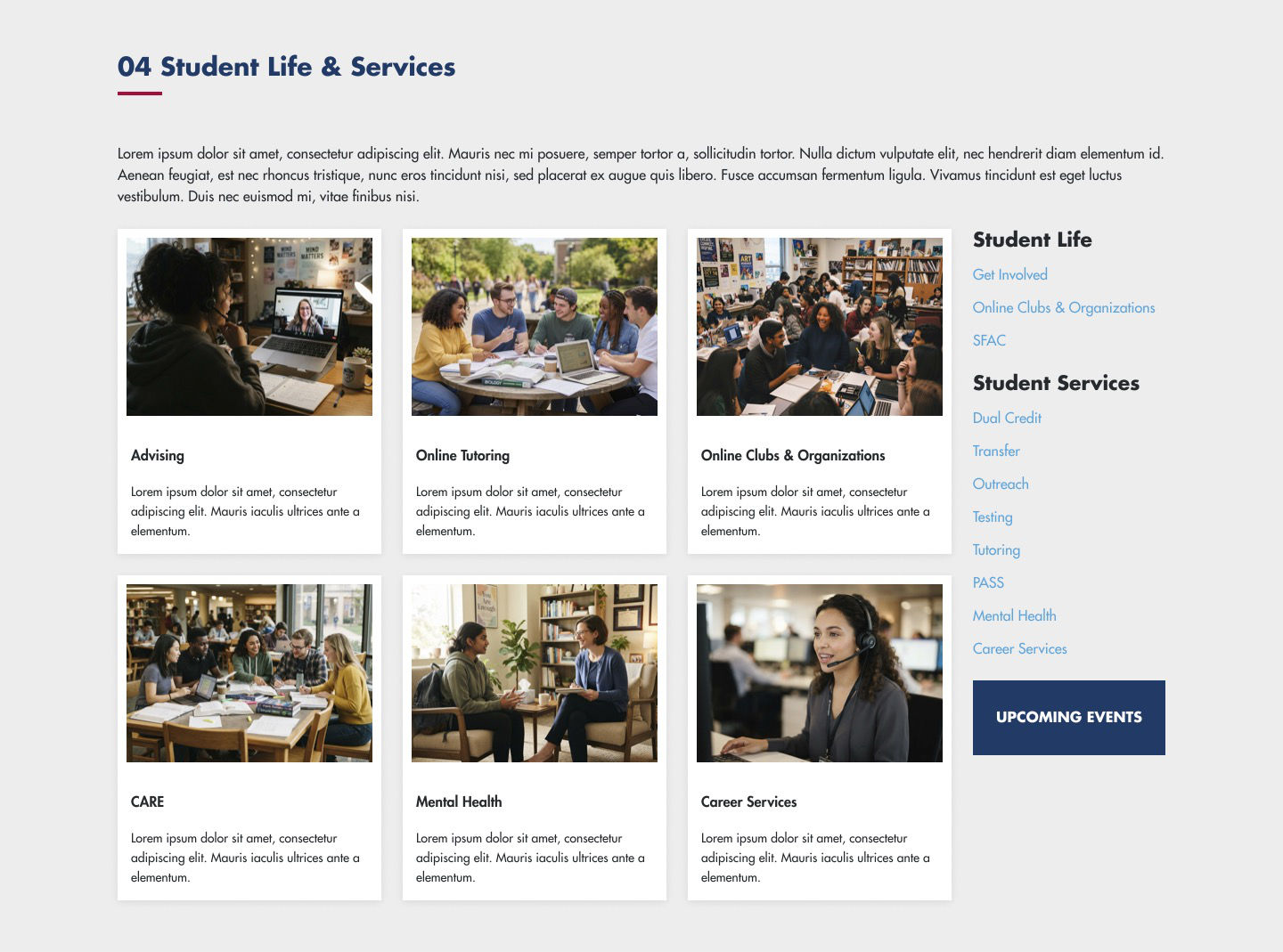
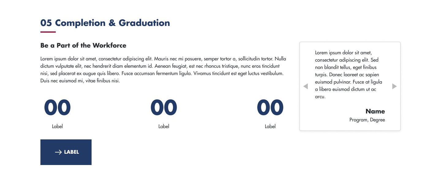
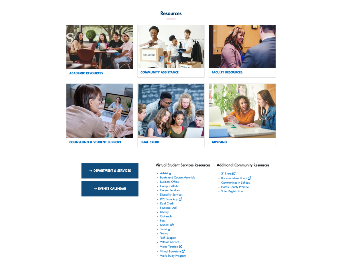
Working from approved wireframes and the existing brand and web guidelines, I built a component and style library in Figma, produced desktop and mobile layouts, generated placeholder photography, and partnered with a copywriter on the UI text.
Results
A Rationalized Content Base
The multi-pass audit produced a single, verifiable inventory that gave the team a clear picture of what to keep, consolidate, or retire.
Established Student Journey Spine
A site map organized existing pages against the Student Journey Spine, giving the redesign a clear, user-centered information architecture.
Design-Ready Foundation
Four research-backed personas, a reusable Figma component library, and desktop and mobile home page designs positioned the team to move confidently into build.
5
Journey Steps
The journey spine is easily understood in 5 steps.
25%
Reduced Overall Size
Provided users with what they needed first reducing overall page size.
50%
Reduced Research Time
With an AI, time spent doing normal research was significantly reduced.