Icon - Jen + Brian

Jen + Brian

Client Jen + Brian Industry Personal Year 2017
01

Overview

While there are many wedding site builders out there, most would lack some of the functions and layout aesthetics my fiancee and I would have liked. As an experienced UX/UI Designer and Web Developer, I wanted to use my skills to give my fiancee the site that would make her feel special with the assurance that it would have what it needed to tell our guests about our special day.
02

Exploration

Working with my fiancee, we took some time to review other wedding sites and study what many of them would do in regards to layout and functionality. Researched sites included ones posted on portfolio sites and our friends’ wedding sites. Our research led us to the following goals for our site:

  • Visually appealing, but not distracting
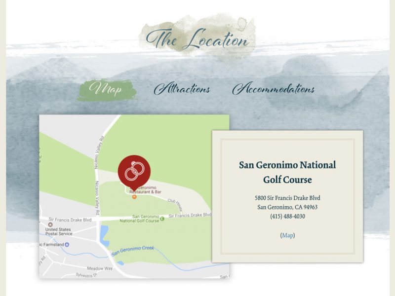
  • Provide basic information regarding the day of the wedding
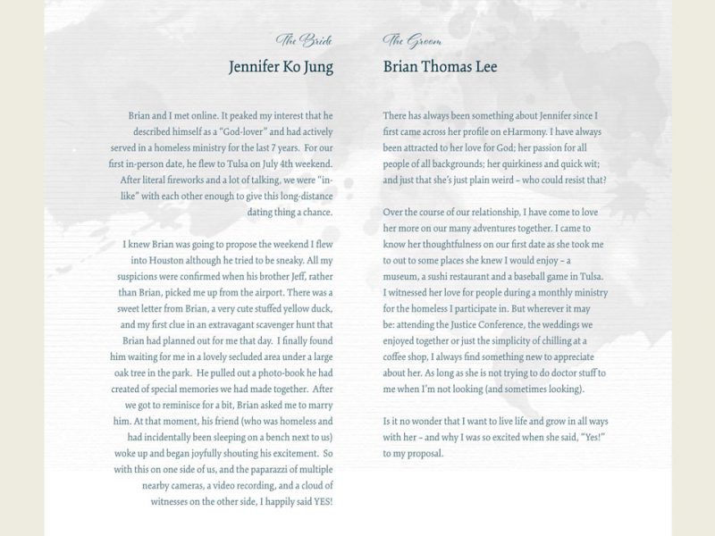
  • Tell each of our stories
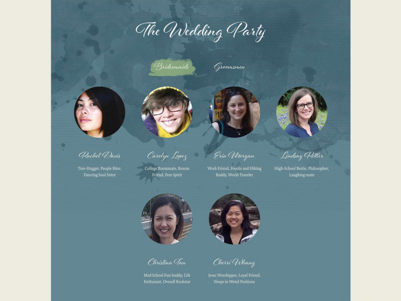
  • Introduces our wedding party
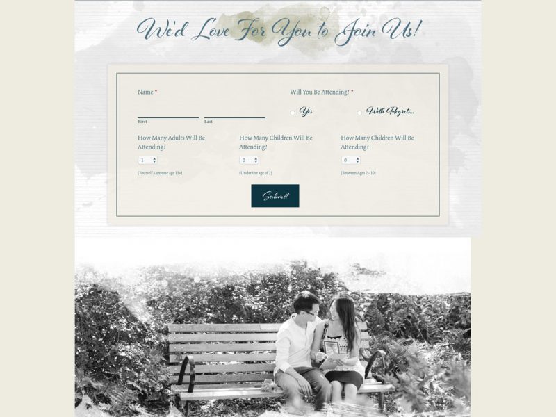
  • Allow potential guest to RSVP through a simple form
03

The Approach

Moodboard

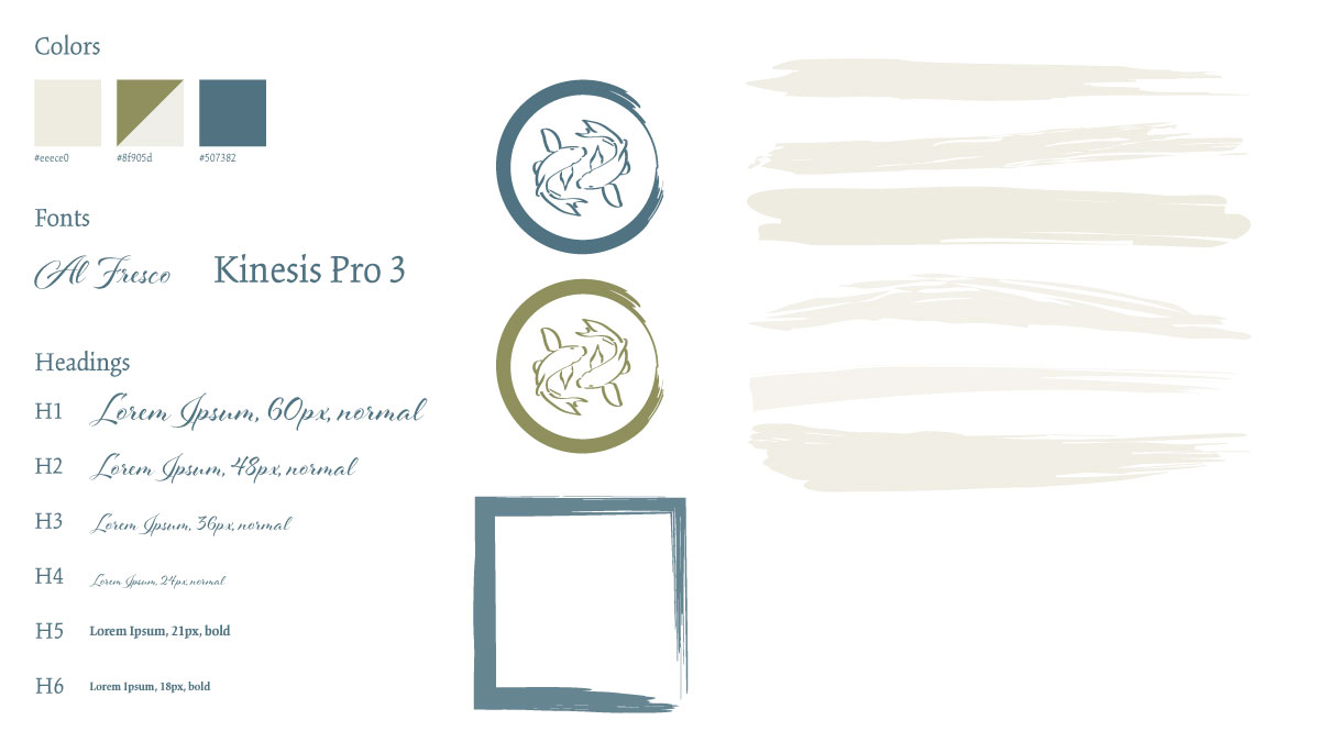
Using my fiancee’s Pinterest page, I began sketching the look and feel on to a moodboard. Her page showed many images of a rustic and chic look that I sought to emulate in the style of the site. Her colors centered around cream colors – rather than white – and blues. There were also many images of painted signs with handwritten lettering.

These design aspects found their way into my moodboard.

Jen + Brian Moodboard

Branding

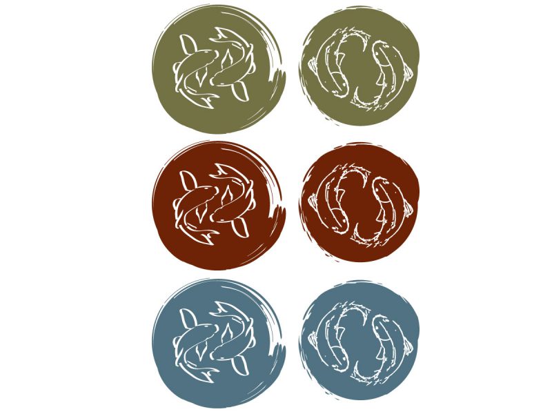
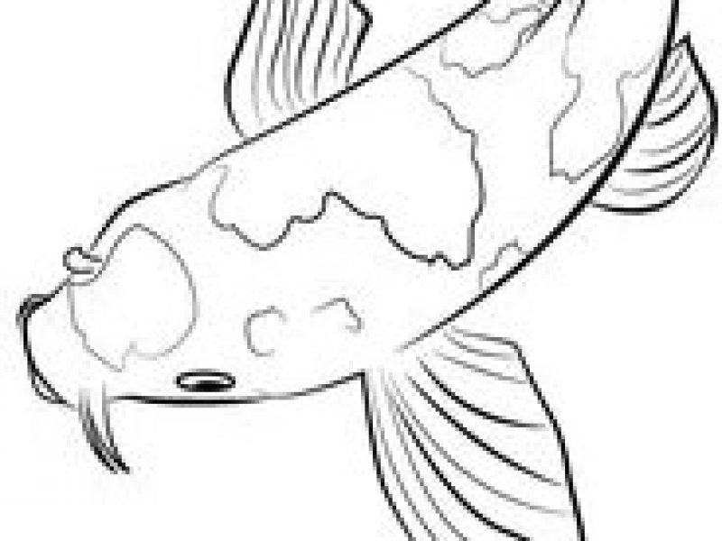
My fiancee grew up loving fish and wanted this to somehow be a part of the wedding. We also believe in the idea that marriage is eternal and should be represented in the branding. I approached this by looking for an image for a fish swimming in a half circle to use as a guide. Using the designs from the moodboard, I added the painterly aspect to the design of the branding to the fish.

Development

As with most of my sites, I developed the site using WordPress using a “blank” theme and leveraging plugins such as Advanced Custom Fields to create a functional and visually creative site my fiancee would love and would help our guests get the information they needed for the wedding. Designing and developing my own theme helps me to put my own personal touches to a site and allows me to known and troubleshoot my own code.

04

The Results

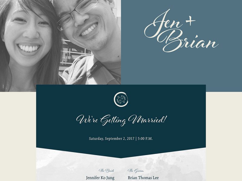
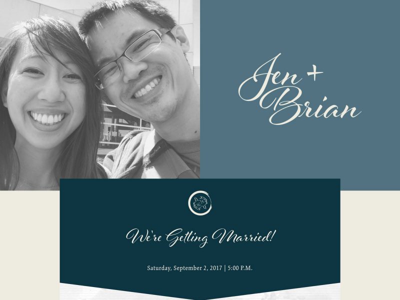
The end result of the design and development is a beautiful one-page layout that encouraged users to scroll down to read our story, to learn a little about the people that have been special in our lives, to be invited to our wedding and to come and be part of our day.

05

Epilogue

Upon reflection, here are some of my key takeaways from this project:

Mobile Experience

Improvements could be made to the mobile experience. Instead of just a responsive design, I think I could have had a design that was more specifically tailored to users who were using their smartphones to view the site. Such updates would have been to improve the line-height of several headers to reduce scrolling tightened the visual spacing that seemed to be jarring with as much space as there was on the desktop. Updating some of the animations on the Groomsmen and Bridesmaid section to include individual animations of objects like the image and the text would have added a small perk for the user’s visual experience.

Dimension

While I’m satisfied with the overall design, adding some visual dimension to the site would have added some appeal for the users. Objects with drop shadows floating over the centered content would have made the design less flat, almost giving the user a sense that they could look beyond just straight down at the site, but underneath it as well.