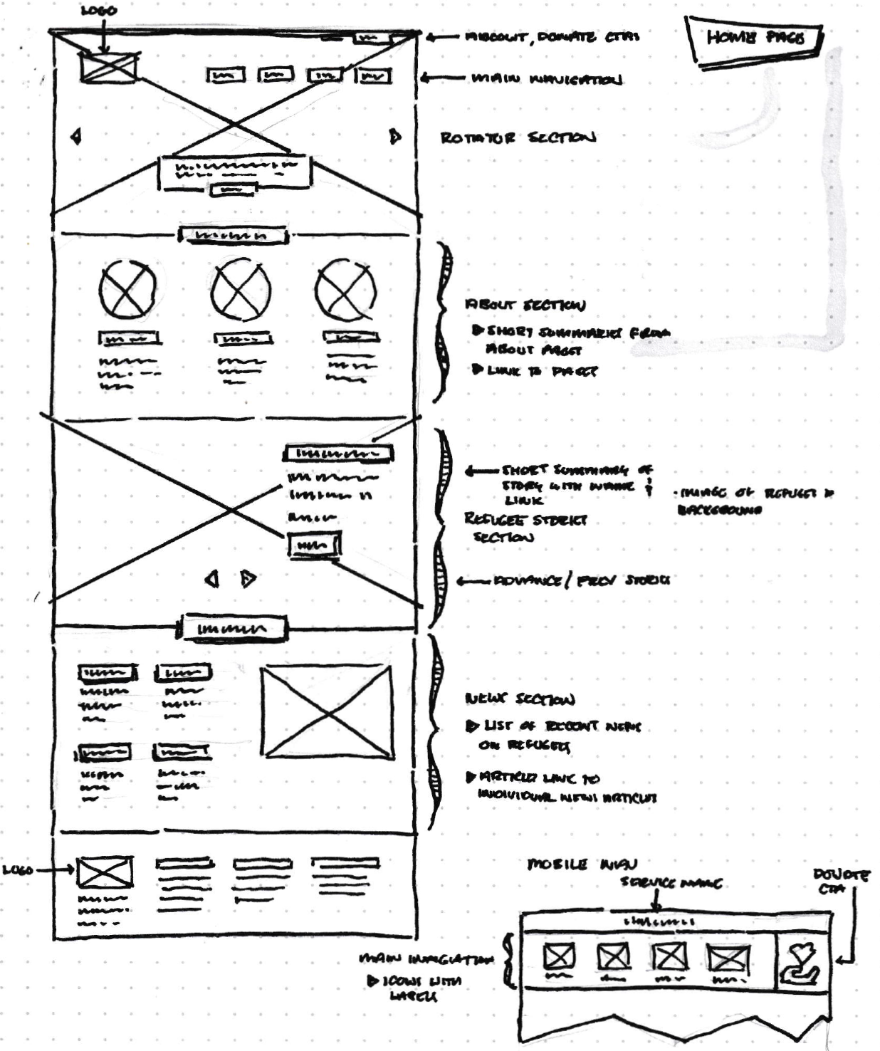
High-Fidelity Concepts
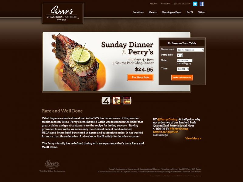
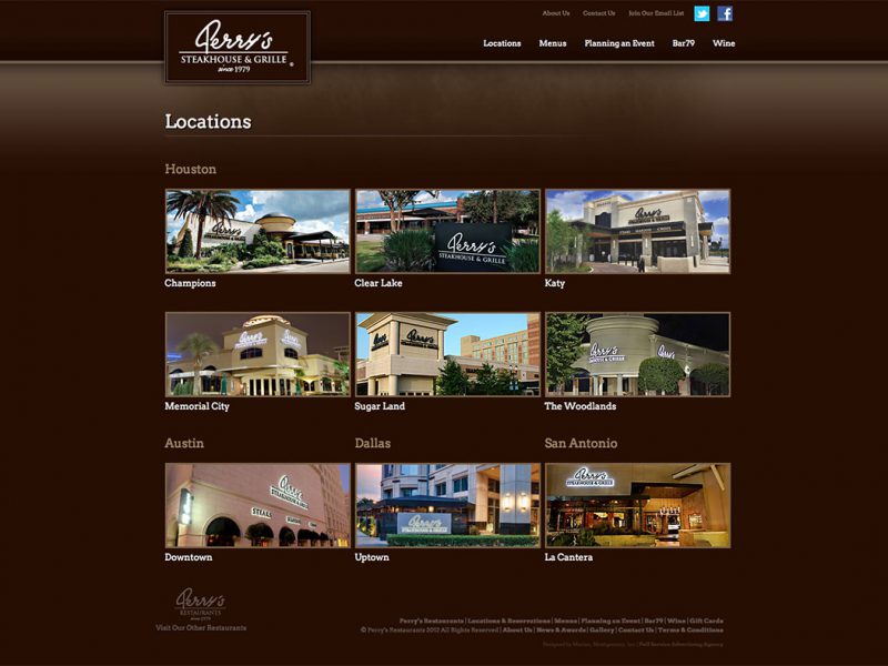
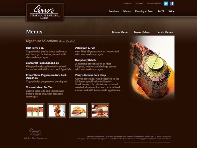
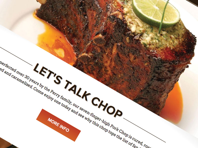
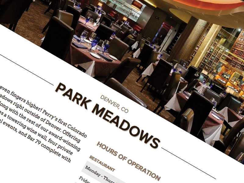
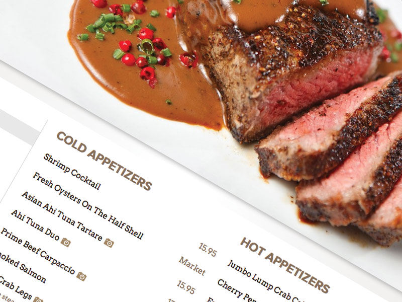
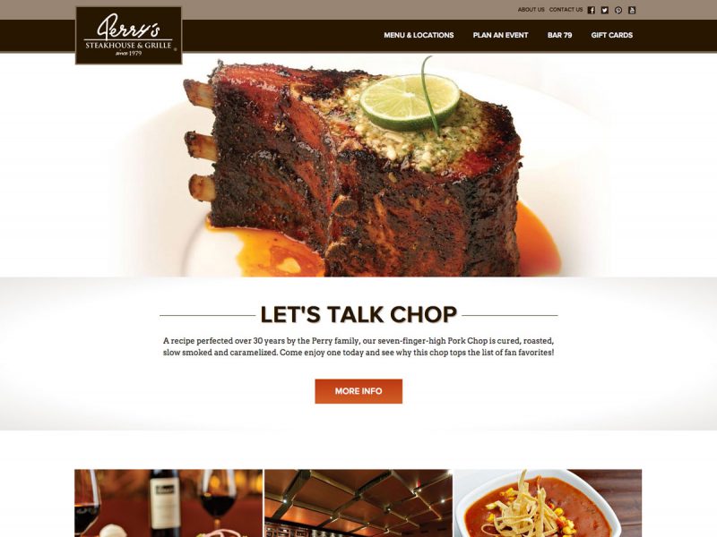
Using the wireframes, I worked on the high-fidelity concepts. Using the brand guidelines provided by the graphic designer, the site began to take shape. While the rich, chocolate brown remained a part of the branding from the previous site, for the large photographs to stand out, I chose to use white for the body background. The imagery of the products or the environment of the restaurant were used to create a visual separation between sections of content.
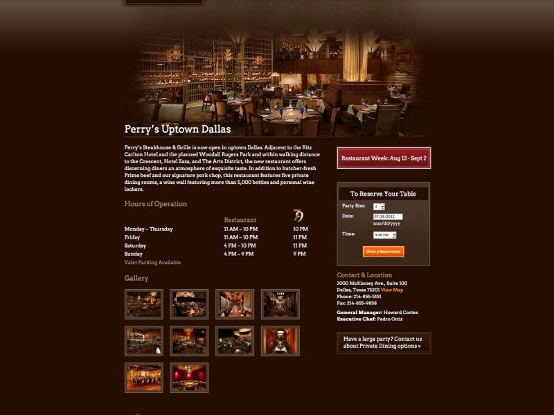
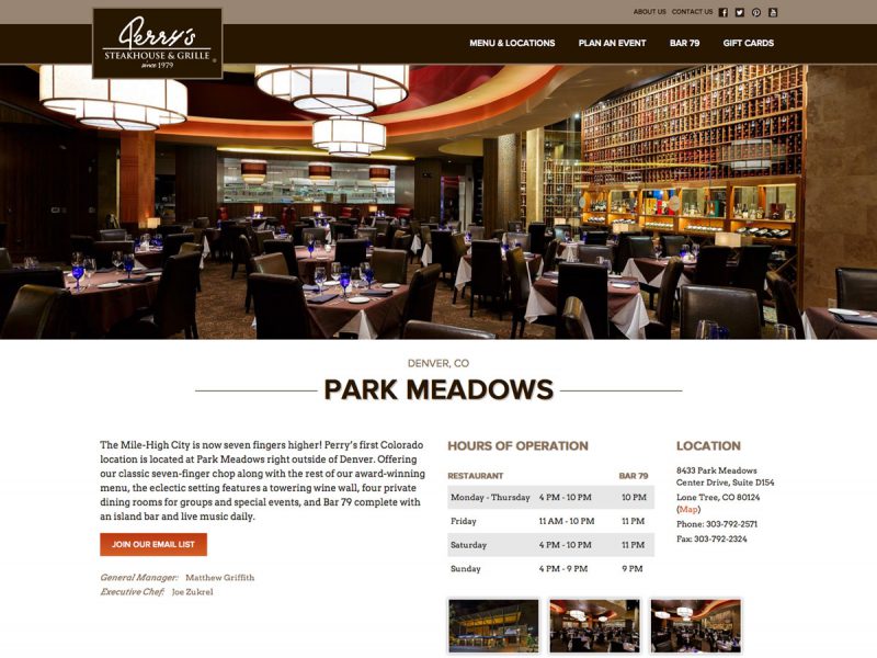
During analysis, it was found that users and the client were frustrated by the need to click further into the site to find information about a particular location. To alleviate this issue, I turned to creating a one-page layout that put all of the content on each individual location page. To reduce some of the scrolling, I used tab functions to hide some of the content until the user chose to look at it.
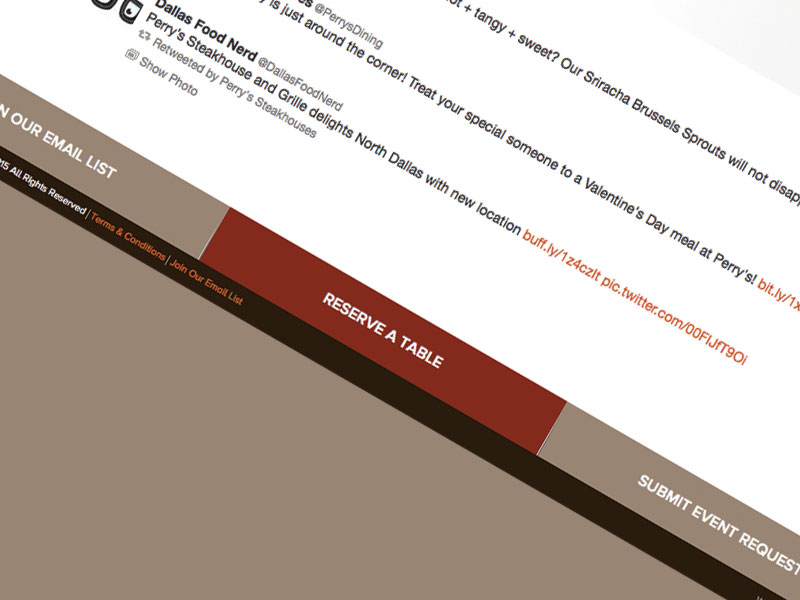
Making reservations was also of high importance to the client, so I decided to have it visible at all times in the footer which would remain at the bottom of the browser above all the content at all times.
